http://www1.eere.energy.gov/vehiclesandfuels/facts/2008_fotw546.html
A bilateral graph is used to display two or more sets of related data on the same graph and can be a line graph, bar graph, or another type of graph.
Thursday, April 17, 2014
Nominal Area Choropleth Maps
http://politicalmaps.org/2008-house-of-representatives-election-maps/
A nominal area choropleth map is used to display nominal data which is simply data that can not be organized quantitatively. The data is grouped so that different colors represent different categories. The map above displays the U.S. House Winners by district across the United States.
Unstandardized Choropleth Maps
http://www.culturebore.com/2010/06/billion-dollar-language-barrier-in.html
An unstandardized choropleth map displays data sets as raw numbers instead of averaging the data. The unstandardized choropleth map above shows which language is dominant in a particular area of Afghanistan.
Standardized Choropleth Maps
http://mchb.hrsa.gov/mchirc/dataspeak/events/feb_08/materials/kirby_files/textonly/slide10.html
A standardized choropleth map uses standardized levels of data so that the data can be areally averaged and then compared to other areas of different sizes. The map above shows the standardized ratios of low birth weight.
Univariate Choropleth Maps
http://www.dailyyonder.com/files/images/
A univariate choropleth map simply displays a single variable across a region. In this particular example above, we are viewing the percent of people living in poverty across the rural United States.
Bivariate Choropleth Maps
http://www.personal.psu.edu/faculty/c/a/cab38/GEOG321/14_multivariate02/multivariate.html
A bivariate choropleth map is used to display two variables on a single map by combining two different sets of colors and is very useful in graphically illustrating the relationship between two spatially distributed variables. The bivariate choropleth map above measure percent change and the population density across the United States.
Unclassed Choropleth Maps
http://www.nws.noaa.gov/os/lightning/images/Vaisala_96-05_Flash_Map.gif
Unclassed choropleth map do not have an averaged statistic towards each particular color which means that the color shades are directly proportional to the values of each enumeration unit. The unclassed choropleth map above shows the flash densities across the nation from 1996 to 2005.
Classed Choropleth Maps
http://geoanalytics.net/and/papers/ica01.pdf
A Classed Choropleth map is just a choropleth map that separates the measured variable into certain classifications. These maps use smaller intervals to portray the data and are broken down into a scale that is presented by using colored intervals. The classed choropleth map above displays the birth rates of Europe by shading the countries different colors.
Star Plots
http://www.itl.nist.gov/div898/handbook/eda/section3/starplot.htm
A star plot is useful for displaying multivariate data with each star representing a single observation. The star plots above are of 16 different cars with many variables being plotted and analyzed.
Correlation Matrix
http://www.investors-routemap.co.uk/Guidebook_price_correlation.html
A correlation matrix is a table that contains correlation coefficients among several markets in different time frames. The correlation matrix above is displaying the relationships between the principal bond and forex markets as well as equity regions, sectors, and investing styles for which Investors RouteMap generates recommendations.
Similarity Matrix
http://www.biomedcentral.com/1471-2164/8/353/
A similarity matrix is a matrix of scores which represent the similarity between a number of data points and each element of the matrix contains a measure of similarity between two of the data points. The image above is a similarity matrix that is displaying gene expression.
Stem and Leaf Plot
http://www.albany.edu/~reinhold/m308/Assgnmt1_HowTo.htm
A stem and leaf plot is a way of organizing numerical data in order of place of value. These plots are useful in determining the frequency of a specific data point. The stem and leaf plot above shows the distribution of adult heights.
Box plot
http://en.wikipedia.org/wiki/Box_plot
A box plot graphical depicts groups of numerical data through their quartiles. The box plot above graphs data from the Michelson-Morley experiment.
Histogram
http://searchsoftwarequality.techtarget.com/definition/histogram
A histogram displays statistical information by using rectangles to show the frequency of data items in successive numerical intervals of equal size. Most commonly, the independent variable is plotted on the horizontal axis while the dependent variable is plotted on the vertical axis. The histogram above is plotting the number of students and their scores on the final exam.
Parallel coordinate graph
http://en.wikipedia.org/wiki/Parallel_coordinates
This graph above is a parallel coordinate plot which is used to visualize high-dimensional geometry and analyzing multivariate data. This type of graph is closely related to time series visualizations except that it is applied to data where the axes do not correspond to points in time.
Triangular Plot
http://en.wikipedia.org/wiki/Ternary_plot
A triangular plot, also known as a ternary plot, is a barycentric plot on three variables which sum to a constant and it is useful for graphically depicting the ratios of the three variables as positions in an equilateral triangle. These plots are mainly used in physical chemistry, petrology, mineralogy, metallurgy, and several other physical sciences. The triangular plot above is a flammability diagram for methane.
Wind rose
http://en.wikipedia.org/wiki/Wind_rose
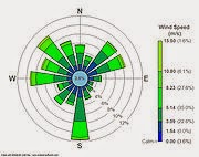
A wind rose is a graphic tool that is used by meteorologists to see how wind speed and direction are typically distributed at a determined location. The wind rose above displays the wind speed and direction for LaGuardia Airport, New York.
Climograph
http://en.wikipedia.org/wiki/Climograph
A Climograph uses a graphical representation to display the basic climatic parameters of average temperature and precipitation for a specific geographic area. This graph allows us to see a quick view of the climate of a location. The climograph above shows the average temperature and precipitation for Calcutta.
Population Profile
http://www.bmj.com/content/324/7331/207
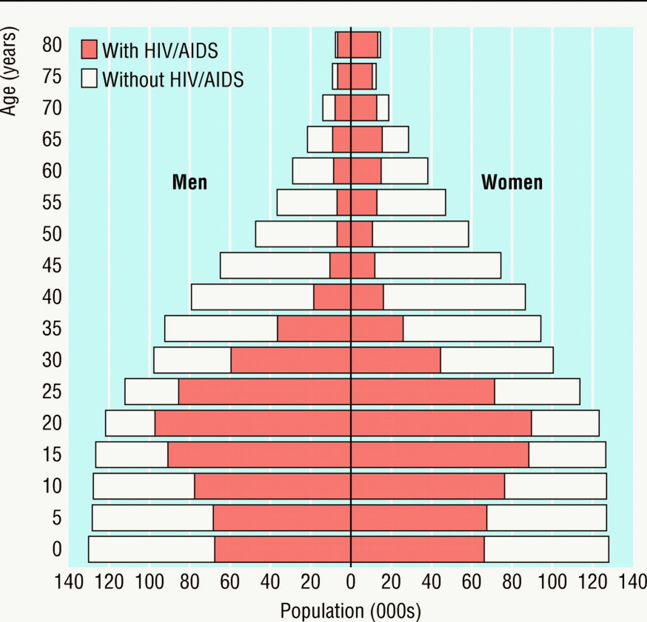
A population profile is produced by overlapping two or more bar graphs and are useful for showing the number of people as a function of their ages. The population profile chart above displays the number of men and women with and without HIV/AIDS for a range of different ages.
Scatter plot
http://en.wikipedia.org/wiki/Scatter_plot
A scatter plot is a mathematical diagram that uses Cartesian coordinates to display values for two variables for a specific data set. Scatter plots provide a useful summary for a set of bivariate data and can be used to determine what kind of relationship there might be between the two variables. The scatter plot above displays the waiting time between Old Faithful Eruptions as well as the eruption duration.
Subscribe to:
Posts (Atom)